library(ggthemes)
library(sf)
library(sugarbag)
library(tidyverse)
library(plotly)Hexmaps with sugarbag make it easier to see the electoral map
data visualisation
statistics
teaching
spatial data
Australia is a land of wide open spaces where the population concentrates in small areas. It can make for misleading map visualisations on statistics related to people. The May 20, 2022 ABC article The Australian election map has been lying to you explains this very neatly. It has alsp provided a better alternative to examine election results, in the form of a hexmap of Australia. The hexmap provided in the article is almost certainly manually constructed which is find for a construct once, use many times purpose.
When you want to be able to make a hexmap on new spatial data or if the spatial groups change, the R package sugarbag can be helpful. This post explains how to do this, using the results as we have them today from yesterday’s election. (We’ll update these once the final results are released.)
Here’s how to get started. Download the current spatial boundaries for electorates, from Australian Electoral Commission web site.
Load the libraries we need:
Read in the spatial polygons, defining the boundaries. These files can be very large, and slow to draw. For these visualisations faster to draw is more important, so the boundaries can be simplified using rmapshaper::ms_simplify.
# Spatial polygons
electorates <- sf::st_read("2021-Cwlth_electoral_boundaries_ESRI/2021_ELB_region.shp")
electorates_small <- electorates %>% rmapshaper::ms_simplify(keep = 0.01, keep_shapes = TRUE)
Next we need the election results. The ones here are manually constructed from the ABC results website. These results are joined to the map polygons, and colours are manually constructed to be one typically used by the party. The ggplotly() function enables labels to pop up on mouseover.
# Read in data on current electoral results
new <- read_csv("electoral_2022.csv") %>%
  select(Electorate:Party)
new_major <- new %>%
  mutate(Party_maj = fct_collapse(Party,
         LNP = c("LIB", "LNP", "NAT")))
electorates_small <- electorates_small %>%
  left_join(new_major, by=c("Elect_div"="Electorate"))
map <- ggplot() +
  geom_sf(data=electorates_small,
                   aes(fill = Party_maj,
                       label=Elect_div),
                       colour="white") +
  scale_fill_manual("", values=c("ALP"="#E13940",
                                   "LNP"="#1C4F9C",
                                   "GRN"="#009C3D",
                                   "KAP"="#906E3E",
                                   "CA"="#FFC000",
                                   "IND"="#66b2b2",
                                   "UNDEC"="#808080")) +
  theme_map()
map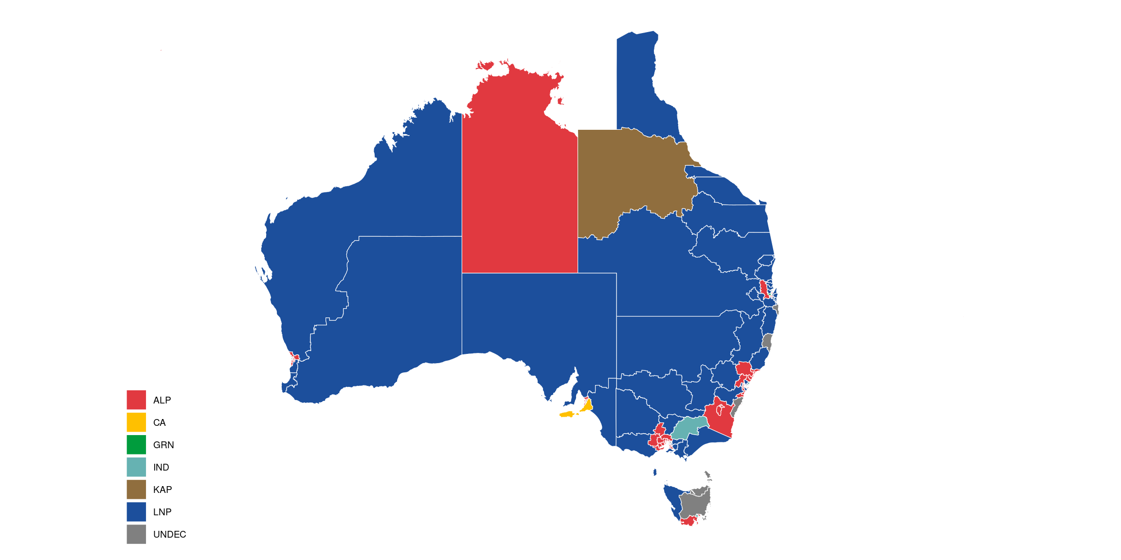
#ggplotly(map)An interactive version can be found here.
The map is blue – it looks like the coalition won the election in a landslide, doesn’t it! (Please note the strange shape of the Cape of York is from the AEC spatial polygons provided! It is not due the the polygon thinning.)
To convert this into a hexmap, automatically with sugarbag, we need to
- Find the centroids of each polygon.
- Create a hexagon grid with a desired size of hexagon,
hscontrols this. - Allocate electorates to a spot on the grid.
- Turn the hexagon centroids into hexagons.
- Join with election results.
- Make it interactive using
ggplotly().
# Find centroids of polygons
sf_use_s2(FALSE)
centroids <- electorates %>%
  create_centroids(., "Elect_div")

## Create hexagon grid
hs <- 0.8
grid <- create_grid(centroids = centroids,
                    hex_size = hs,
                    buffer_dist = 5)

## Allocate polygon centroids to hexagon grid points
electorate_hexmap <- allocate(
  centroids = centroids,
  hex_grid = grid,
  sf_id = "Elect_div",
  ## same column used in create_centroids
  hex_size = hs,
  ## same size used in create_grid
  hex_filter = 10,
  focal_points = capital_cities,
  width = 35,
  verbose = FALSE
)

# Make the hexagons
e_hex <- fortify_hexagon(data = electorate_hexmap,
                            sf_id = "Elect_div",
                            hex_size = hs)
electorate_hexmap_new <- e_hex %>%
  left_join(new_major, by=c("Elect_div"="Electorate"))
hexmap <- ggplot() +
  geom_sf(data=electorates_small,
          fill="grey90", colour="white") +
  geom_polygon(data=electorate_hexmap_new,
             aes(x=long, y=lat,
                 group = hex_id,
                 fill=Party_maj,
                 label=Elect_div)) +
  scale_fill_manual("", values=c("ALP"="#E13940",
                                 "LNP"="#1C4F9C",
                                 "GRN"="#009C3D",
                                 "KAP"="#906E3E",
                                 "CA"="#FFC000",
                                 "IND"="#66b2b2",
                                 "UNDEC"="#808080")) +
  theme_map()
hexmap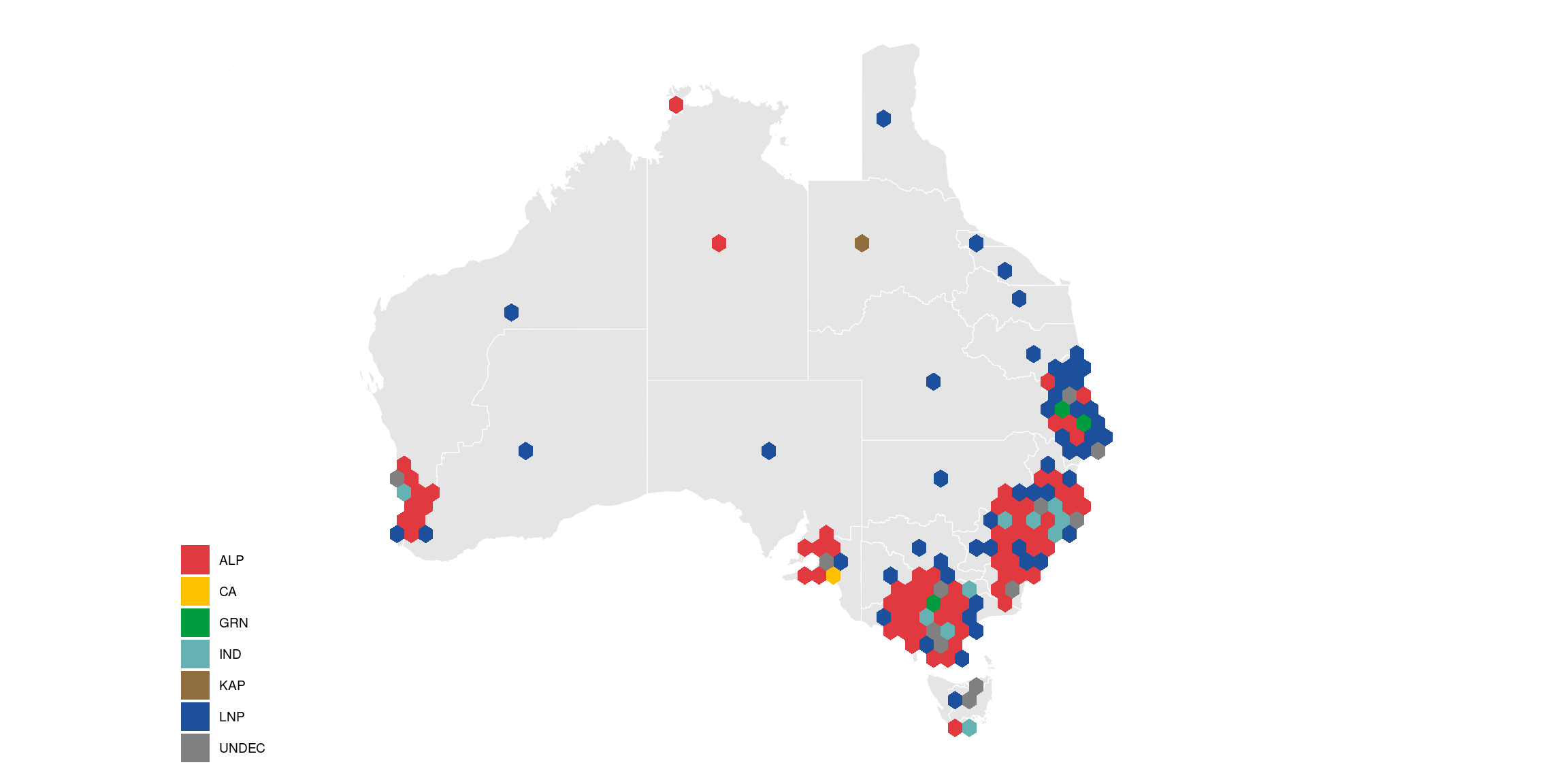
#ggplotly(hexmap)An interactive version can be found here
And that’s it! The sugarbag hexmap will expand the densely populated small areas outwards, while maintaining proximity to neighbouring electorates and to the city centre. It is a type of cartogram algorithm with two important differences: (1) uses equal area for each hexagon instead of sized proportional to population, and (2) allows some hexagons to be separated so that the geographic positions are reasonably preserved.
The hexmap makes it easier to see the results distributed across the country, and clearly with the predominance of red, that Labor won.
Data for this post can be found here.

This work is licensed under a Creative Commons Attribution-NonCommercial-ShareAlike 4.0 International License.